
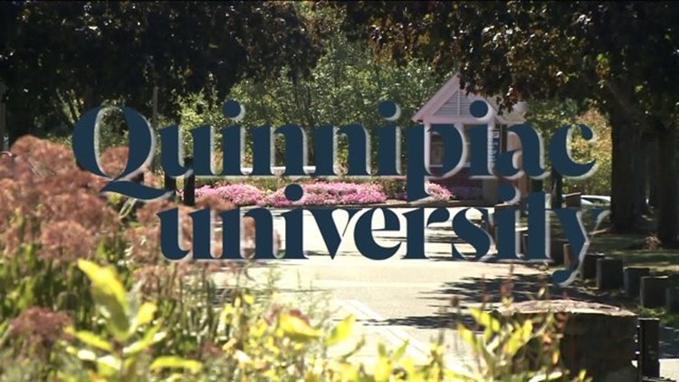
HAMDEN--What is a logo? It's often the thing that connects the public to a brand or entity. And for Quinnipiac University, that brand recognition is suffering.
The school unveiled a new logo in June, with a different typeface and, most notably, a lowercase "u" for university.
Now that school is back in session, students are talking about the change, and they are not happy about it.
One student, Marisa Viggiano, pointed out that besides it looking strange, it's bad grammar. "As a student, it kind of makes us sound like we aren't smart enough to know that it's a proper noun," Viggiano said.
And freshman Shelly Ann Medina thinks it's just plain ugly and doesn't mesh with the vibe of Quinnipiac. "When you walk on the university you can look out any window and see a beautiful view. And then you have this thick, kind of '70s-like font, and it just doesn't connect."
Lynn Bushnell, vice president for public affairs, told FOX 61, "We have no intentions of looking back, only forward as we work to improve Quinnipiac’s stature and visibility in the higher education community."
There is a petition going around to try and get the university to change the logo back. You can find that here.